Project
Ultimate Guitar Tabs 🎸
UX research & interface redesign
Overview
About This Project
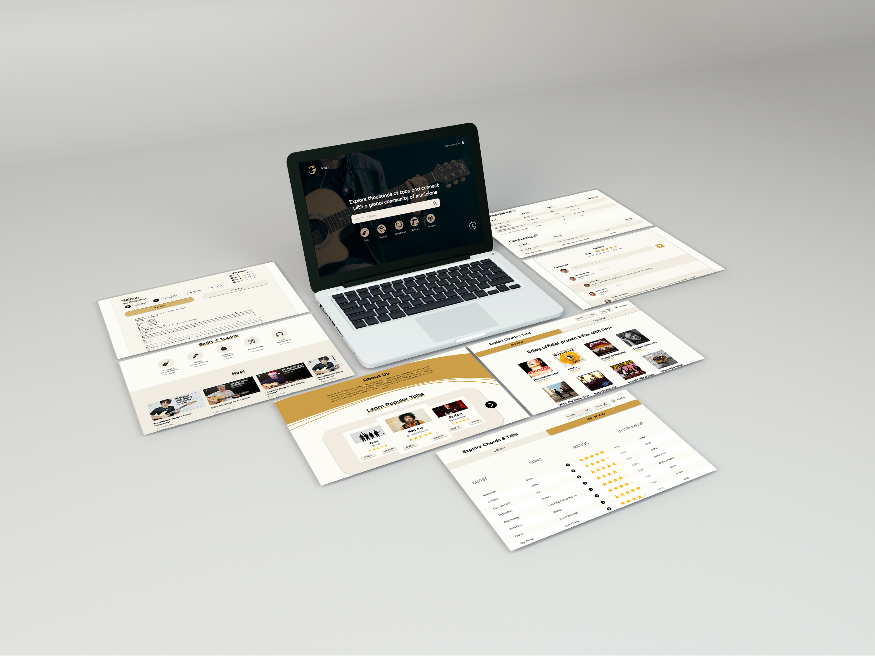
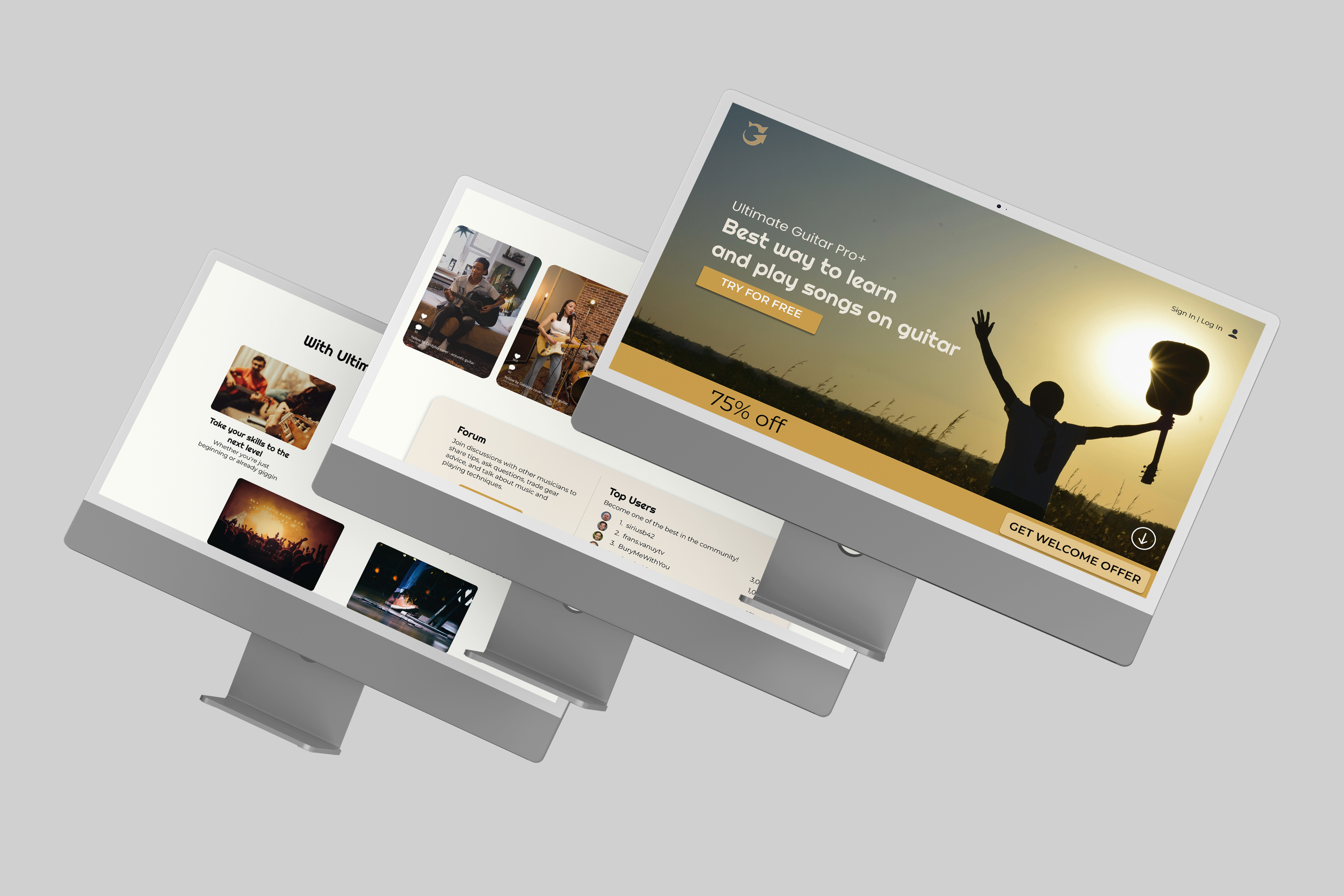
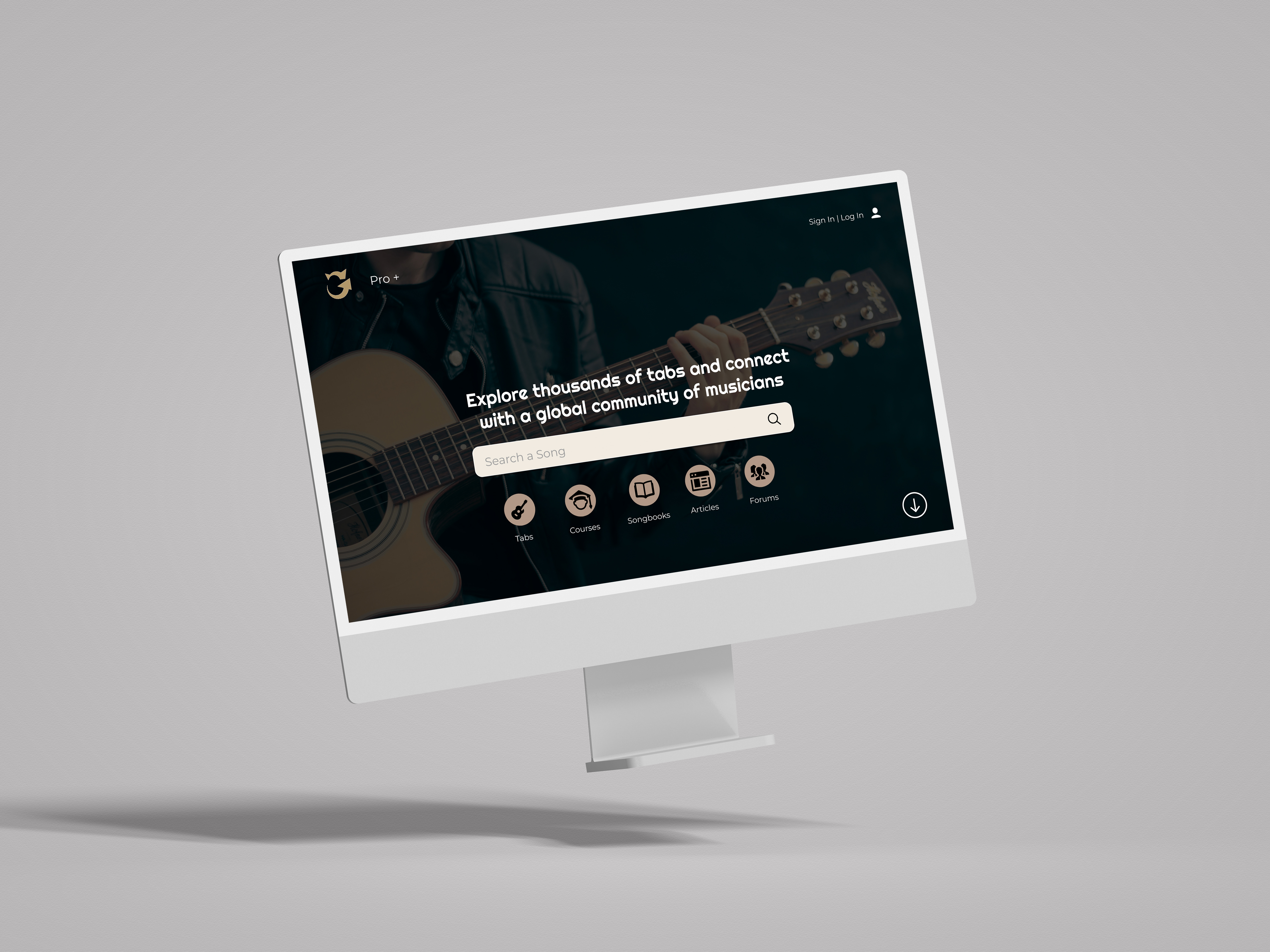
Ultimate Guitar Tabs Redesign is a UX/UI academic project focused on redesigning a music platform used to find guitar tabs, chords, and tutorials. The goal was to improve usability by simplifying navigation, enhancing search accuracy, and creating a more consistent and approachable experience for beginners, intermediate, and professional musicians.
This project examined how content-heavy websites can better support users through clear structure and user-centered design. I contributed to user interviews, persona creation, and journey mapping to identify key pain points such as cluttered layouts, ineffective search, and lack of guidance for new users. The final high-fidelity prototype delivers a cleaner interface with improved navigation flow, standardized typography, and more intuitive search interactions. Usability testing showed increased clarity and ease of use, reinforcing how thoughtful UX decisions can reduce friction and create more accessible learning environments in today’s digital landscape.
Challenge
Main Problem
The original Ultimate Guitar Tabs website feels cluttered, inconsistent, and overwhelming for users. Its disorganized homepage, outdated visuals, and excessive ads make it difficult to navigate or understand where to start. Beginners struggle to find guidance and experienced players are frustrated by unreliable search results and repeated pop-ups. Overall, the site fails to provide a smooth, intuitive experience that supports users in learning and exploring music.
The redesign focuses on creating a cleaner, more intuitive interface with clear navigation and consistent visuals. By simplifying the homepage, improving search and filtering functions, and organizing content by skill level, the new design makes it easier for users to find accurate tabs and tutorials. It also enhances the overall experience with a more welcoming, user-centered layout.
Role
My Role
UX/UI Designer: user research, personas, wireframing, prototyping, and usability testing. Focused on research-driven UX decisions and iterative testing.
Research
User Research Goals
To understand how users search for guitar tabs, chords, and/or tutorials and identify what are the main issues they face in this process that prevent them from quickly and easily finding what they are looking for. To analyze how users engage with different features on the website, such as the ‘#WHATSUP’, lesson sharing, and rating sections, and identify opportunities to make these more intuitive, motivating, and supportive for the guitar community.
Research
Pain Points
Hard to find relevant tabs for beginners who don't know the right terminology - the filtering system is outdated and cluttered. Navigation is disorganized and overwhelming / unappealing design - the homepage feels crowded and not intuitive. Lack of personalization - no way of recommending tabs or tutorials based on the user’s skill level. It's a very one-size-fits-all experience, and that's not ideal. Poor usability in the mobile version - feels way too cramped, buttons are too small, non-intuitive navigation, and most of the page is taken up by unrelated information. Too aggressive with the Pro subscription advertising. Too much unrelated content - tabs like #WHATSUP are distracting and irrelevant.
Research
Problem Statements
Overwhelming and Disorganized Homepage: Users feel lost and confused upon entering the site due to cluttered layouts, excessive text, and poor hierarchy of information. Inefficient Search and Filtering System: Users struggle to quickly find accurate or relevant tabs because the search results are inconsistent, filters are outdated, and the interface feels unintuitive. Lack of Clear Guidance for Beginners: First-time or non-musician users are unsure where to start, as the site lacks visual cues, onboarding, or clear pathways based on skill level. Inconsistent Visual and Functional Design: Page layouts, navigation bars, and features change unpredictably across sections, creating confusion and reducing trust in the interface. Distracting and Unrelated Content: Sections like “#WHATSUP” and excessive ads dominate the main page, shifting attention away from the site’s core purpose — learning and playing guitar. Aggressive Monetization Experience: Constant pop-ups and redirects to “Pro” subscriptions interrupt user flow, making the experience frustrating and unwelcoming.