Project
Iterra 🌎
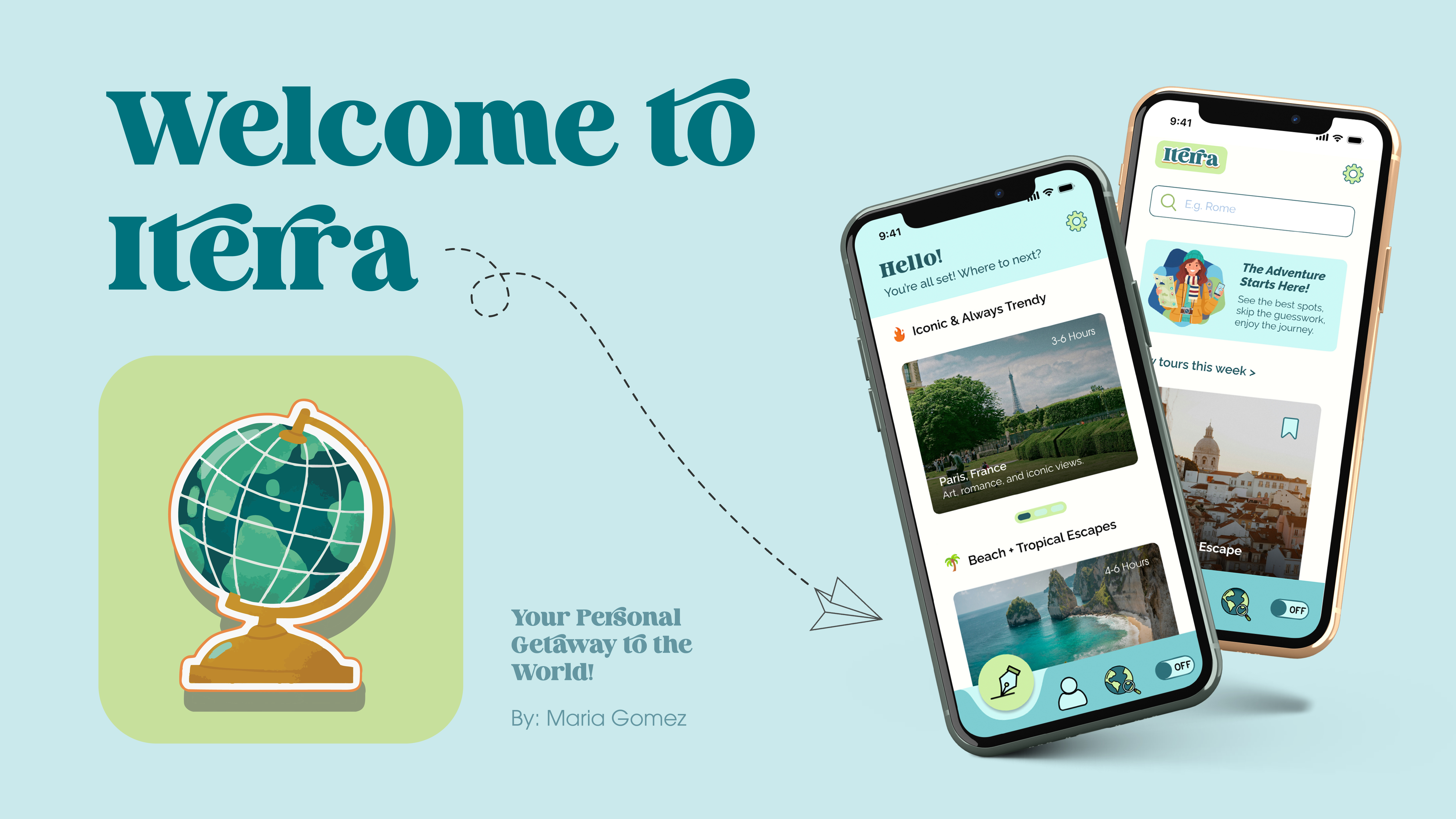
App prototype for trip planning
Overview
About This Project
Iterra is a travel app concept designed to simplify planning and make the experience intuitive, clear, and user-centered.
This project focused on exploring how digital tools can help users plan trips without feeling overwhelmed. The final prototype demonstrates a clean, approachable interface that enables users to organize their trips confidently. Although conceptual, the work highlights how human-centered design can reduce complexity and enhance digital experiences, a key goal in today’s travel tech landscape.
Challenge
Main Problem
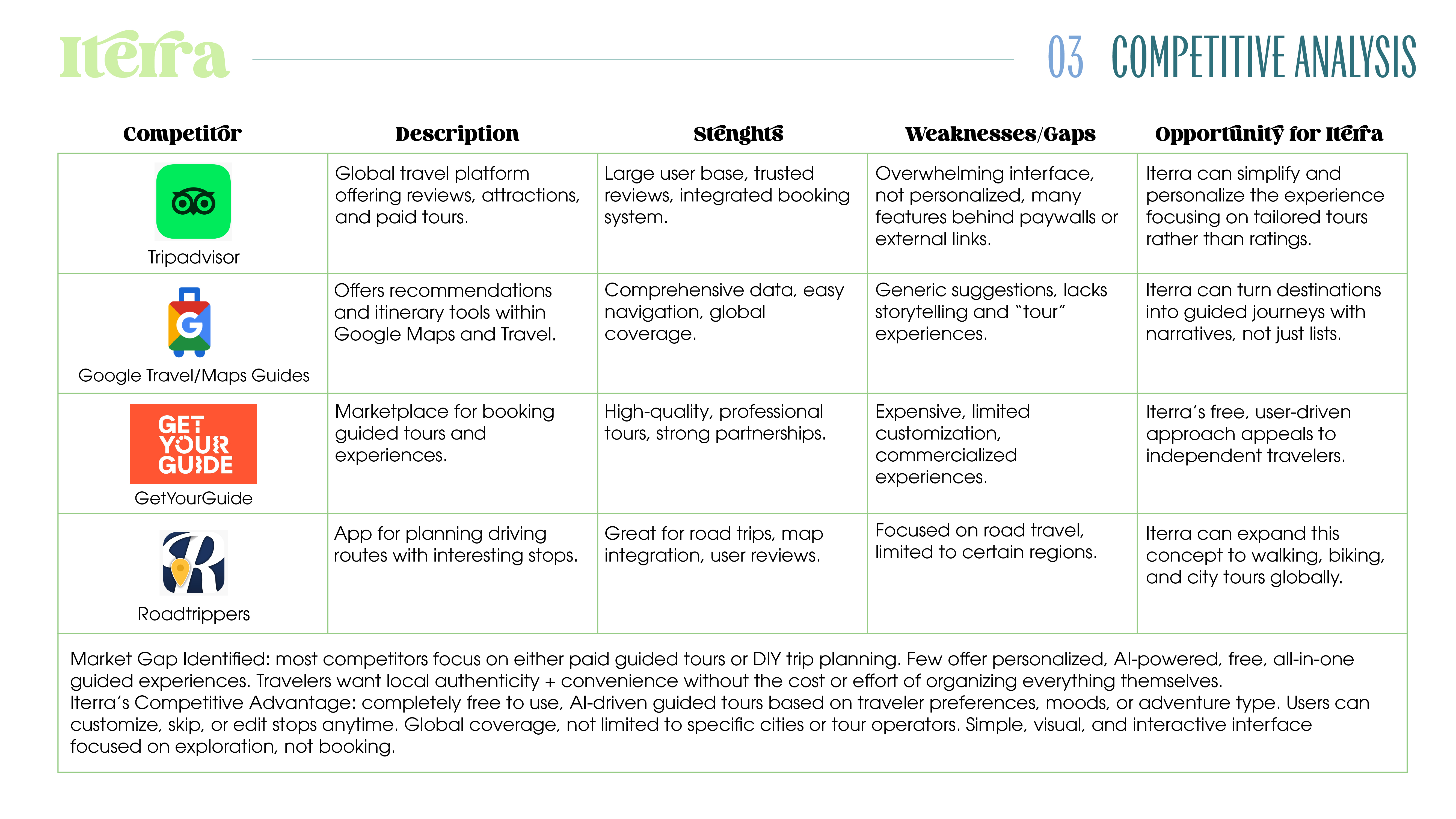
At its core, the project addresses a simple problem: Most travel planning tools are overwhelming, expensive, or lack personalization. Iterra aims to simplify the process while giving travelers more control, confidence, and creativity in shaping their journey.
Role
My Role
Product & UX Designer: complete concept, user flows, wireframing, and interactive prototyping. Focused on defining the product vision and translating research into clear flows. Also, I developed the branding, guiding lterra from early ideation to a fully designed visual concept.
The Structure
Designing With Purpose
The main objective of this project was to design lterra as a cohesive and fully realized digital product, from its visual identity to its interactive prototype. The goals focused on building a strong brand foundation, crafting an intuitive user experience, and presenting the opp in a compelling final showcase. Specifically, the goals included:
-
Build lterra's Complete Branding System
- Develop a memorable and cohesive visual identity.
- Create a solid logo, color palette, and typography system that reflects the spirit of exploration, freedom, and modern travel.
- Establish a consistent visual language that carries across the app and promotional materials.
-
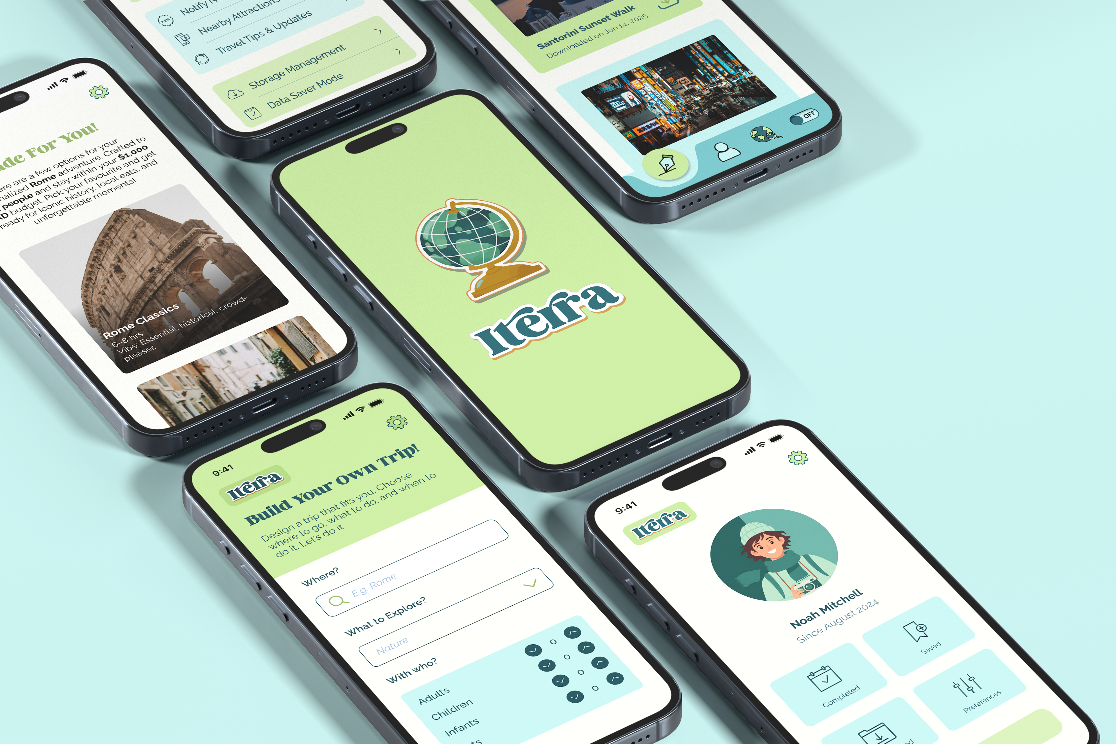
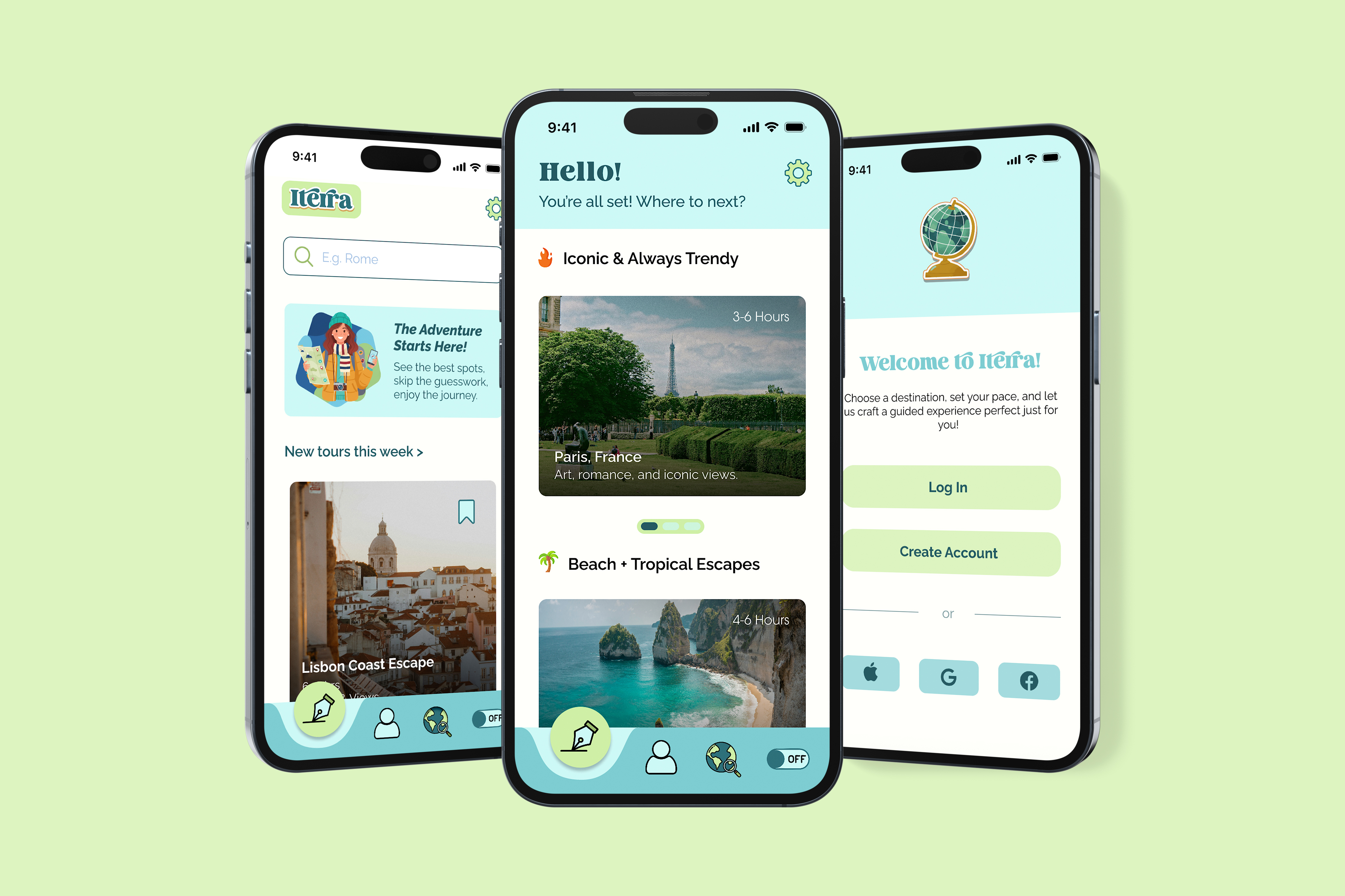
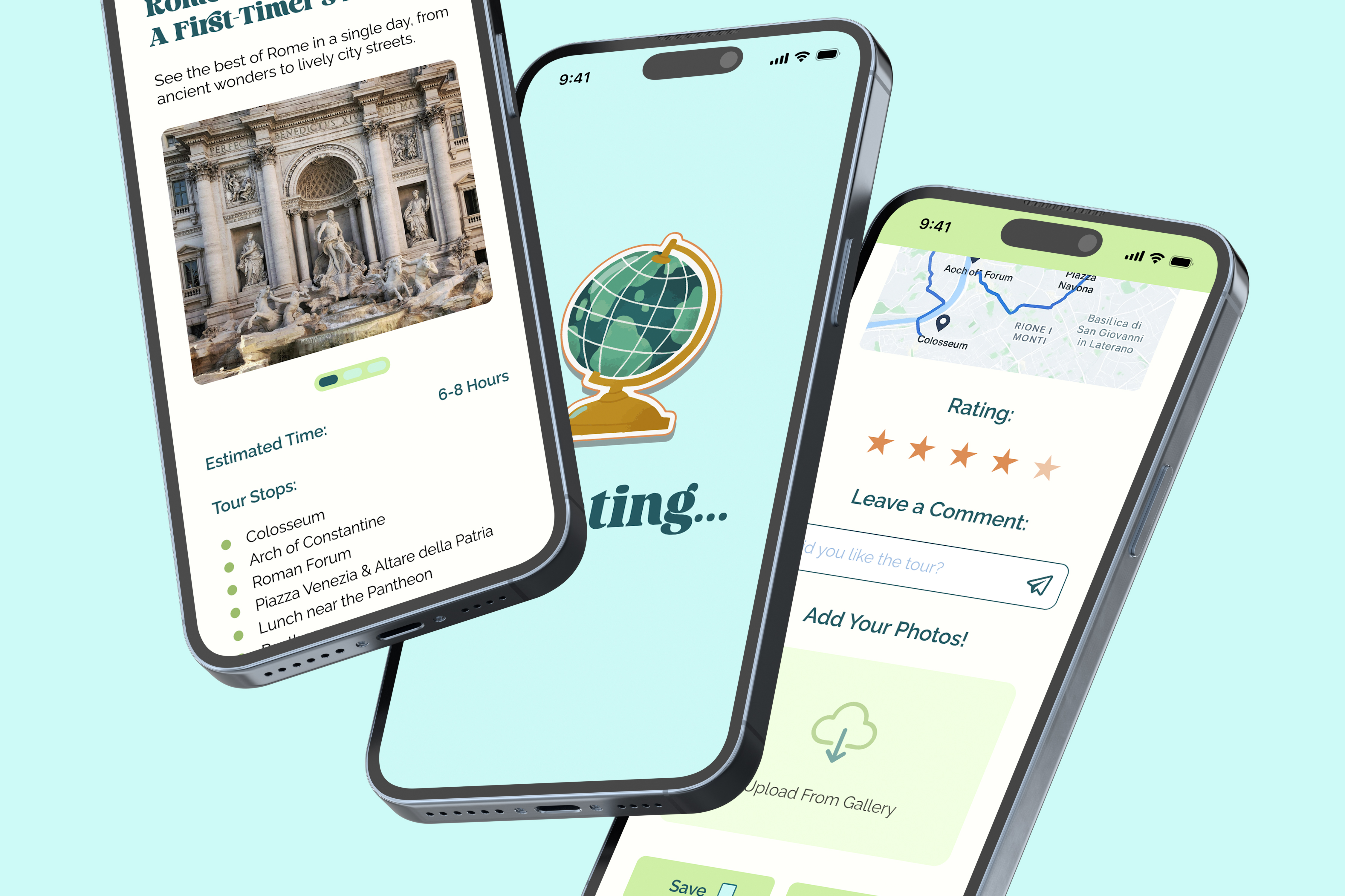
Design the lterra Mobile App Prototype
- Create a user-friendly interface prioritizing simplicity, clarity, and ease of use.
- Design screens, interactions, and flows that support trip discovery, personalized tours, and seamless navigation.
- Ensure that every UI decision enhances accessibility and a smooth user journey.
-
Produce a Final Demo with Interactions
- Deliver a polished interactive prototype showcasing lterra's core features and travel experience.
- Create supporting visual materials—including posters for a social media mini-campaign—to demonstrate how the brand extends beyond the app.
- Present the project as a cohesive narrative from branding, to design, to final execution.
Discover - Define - Design
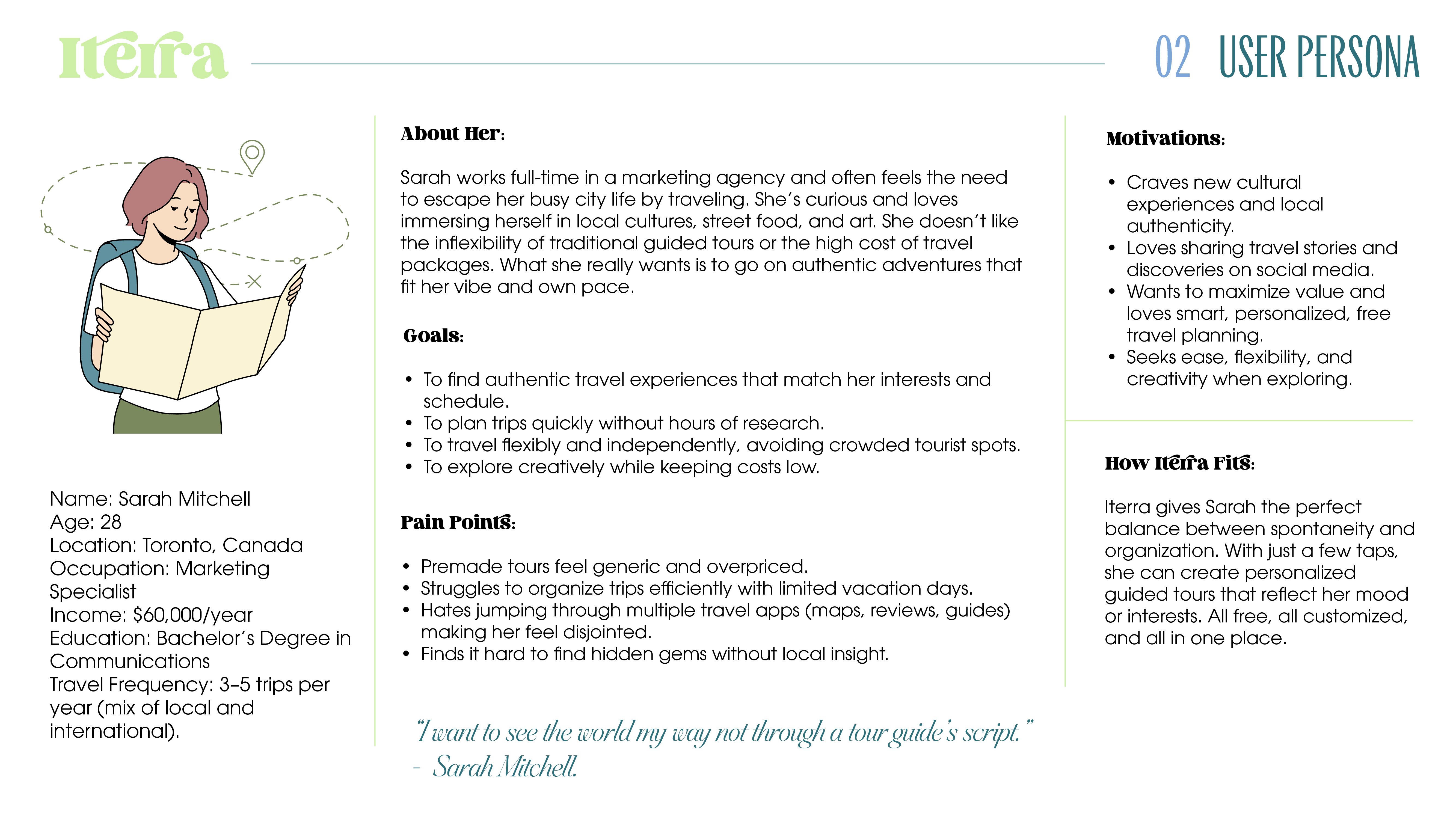
Who am I Designing For?
These are millennial and Gen Z travelers (ages 20–40) who love to explore new destinations but dislike traditional, expensive, and rigid travel tours. They want freedom, personalization, and authenticity in their adventures. These travelers may not plan long in advance but still want organized, meaningful experiences. They rely on apps to guide them spontaneously once they arrive at a destination. Key Traits: Mobile-first oriented. Value authentic, local, and cultural encounters. Often use digital tools (Google Maps, TripAdvisor, Airbnb Experiences, Instagram) to plan trips. Seek practical tools to make travel easier and cheaper.
The Essence
Branding
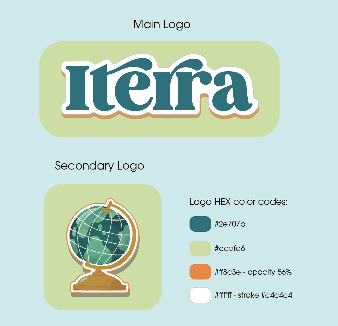
The Iterra logo embodies the spirit of exploration and connection to the world. The name itself combines two Latin words, iter, meaning “journey” or “route,” and terra, meaning “earth,” “land,” or “ground.” Together, they capture the essence of discovering the world through personal journeys. The logo’s playful, rounded typography and teal plus orange colors give it an approachable and adventurous feel, while the soft green background evokes freshness and nature. Designed to resemble a fun travel sticker, the logo reflects Iterra’s youthful energy and journey-focused identity.
Clear Space & Size
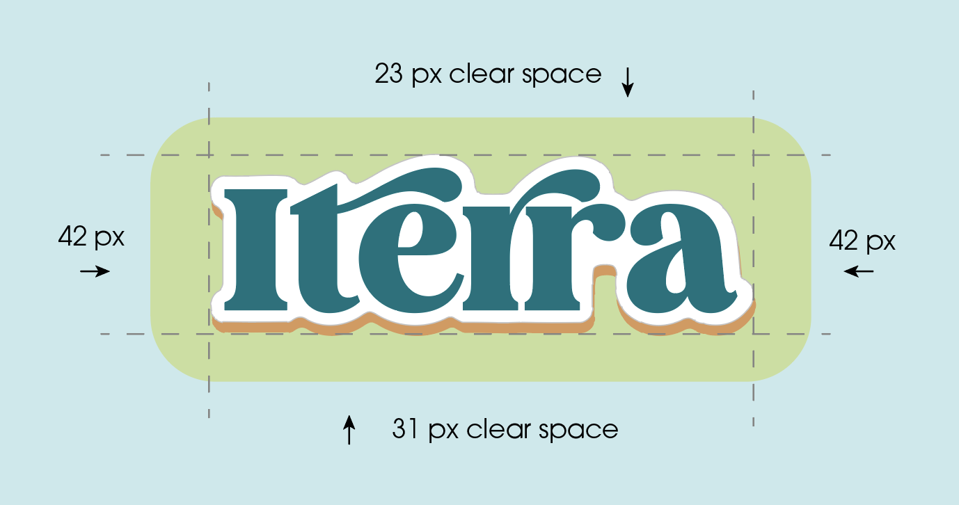
To ensure legibility and brand visibility, the Iterra logo should never appear smaller than for print: 45 mm (width) and digital: 150 px (width). To protect the logo’s visibility and ensure visual balance, always maintain minimum clear space around it. This space must remain free of any text, images, or graphic elements. When displayed at its original size (450 px width), the minimum clear space is left and right: 42 px, top: 23 px, bottom: 31 px. For resized versions, apply these proportions relative to the logo’s width: Left and right: 0.093× logo width, top: 0.051× logo width, bottom: 0.069× logo width.
DO NOT
Do not alter or change the logo’s primary background tones. Do not distort or stretch. Never squeeze or rotate the logo. Do not add effects, drop shadows, gradients, outlines, or textures not part of the approved logo. Do not modify, replace, or redraw the custom letterforms. Do not remove or alter the outline/sticker effect, it’s an intentional part of the design concept. Do not place on low-contrast or busy backgrounds, prioritize clear visibility and contrast at all times. Do not crop, apply transparency or overlays.